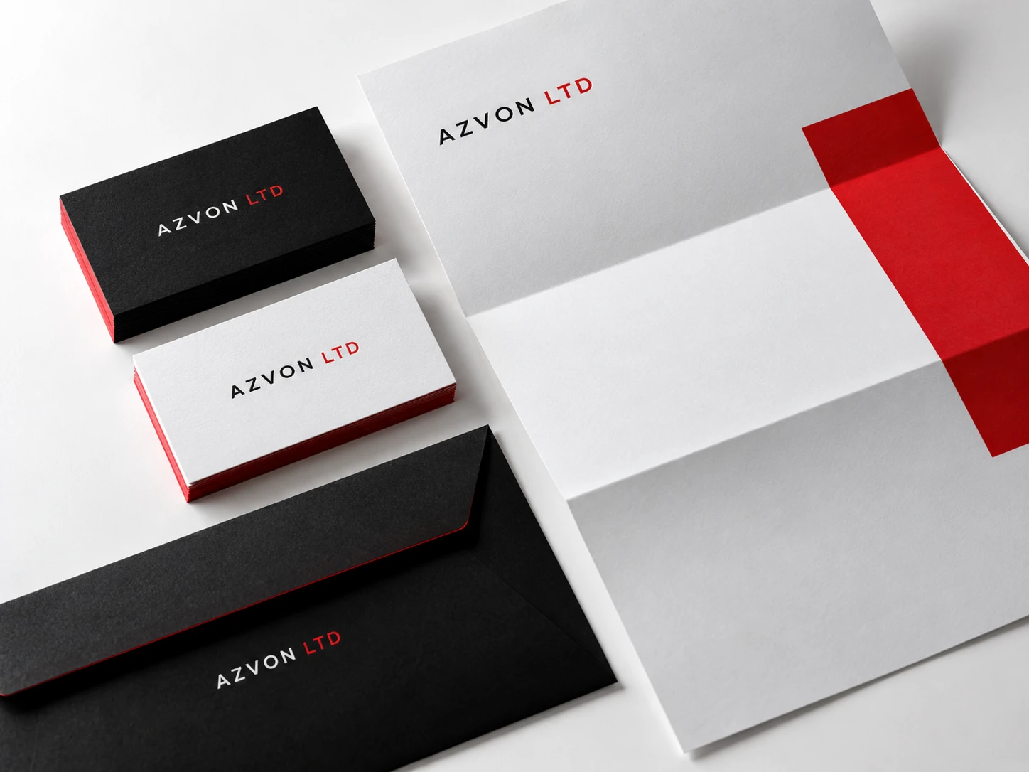
A collection of social graphics should feel connected even when the subject changes. Consistency comes from a few deliberate design rules, not from making every post identical. The aim is to make the brand recognisable while keeping each message easy to understand.
Give each post one main job
Decide whether a graphic introduces a service, explains an idea, shows work or invites a conversation. Lead with the message that supports that job. If several unrelated ideas compete for attention, divide them into separate posts.
Write the headline before arranging the layout. A concise message gives the design a useful hierarchy. Supporting copy can live in the caption when it would make the graphic crowded.
Set a small visual system
Choose a clear relationship between headline type, supporting text, spacing and colour. Define how the logo appears and how much breathing room surrounds it. These decisions should work together across different layouts.
A campaign can use a distinct accent or image treatment while retaining the same type and spacing rules. That allows variety without making the brand feel inconsistent.
Use images for a reason
Choose visuals that help explain the subject or create the right context. A product image, a project screenshot and an abstract brand illustration each serve different purposes. Avoid filling a layout with decorative elements that compete with the message.
Show client work accurately and keep concept graphics clearly labelled. Check the permissions and source of any image before using it in a campaign.
Check the graphic where people will see it
Review the finished graphic at a small size. The main message should remain readable and the composition should still make sense. Adapt the layout for the intended placement rather than relying on a crop to solve every format.
Save the approved rules and templates so future posts can follow the same direction. A practical system makes it easier to produce fresh content while keeping the brand coherent.